CASE STUDY
Dragonfly Approach
B2C
Logo suite
Typography system
Color palette selection
Patterns & textures
Brand in action
Brand guidelines
Dragonfly Approach is a done-with-you AI integration consultancy founded by Daniele O'Leary, helping solo women entrepreneurs and small teams adopt AI in practical, human-first ways. The work centers on making AI accessible and useful without losing the personal guidance that sets a done-with-you approach apart from purely DIY tools or overly technical consulting.
RESULTS
The outcome was a complete brand identity system built around the qualities that define the brand: organic, precise, and human. Through a cohesive logo system, editorial typography, a grounded color palette, and clear brand guidelines, the identity gives Dragonfly Approach a distinct, recognizable presence across brand strategy materials, client-facing decks, and learning content.
The system provides a consistent foundation for future growth while creating a visual language that differentiates Dragonfly Approach from typical AI consultancies and DIY platforms.

Discovery
&
Strategy
The brand identity was shaped through a discovery and strategy process that combined stakeholder interviews, a brand questionnaire, competitive market research, and positioning exercises. By examining how AI consultancies, DIY AI tools, and technical service providers present themselves, we identified an opportunity for Dragonfly Approach to stand apart through a message of hands-on partnership, practical guidance, and human connection rather than technical complexity alone.
These insights informed the brand's voice, tone, and positioning, which were then translated into two visual directions for exploration. Based on client conversations, research findings, and a deeper understanding of Daniele's values and audience, the Rooted & Open direction was selected. Its emphasis on organic, nature-derived forms, editorial typography, and warm composition best reflected Dragonfly Approach's mission of making AI adoption approachable and grounded in real partnership, not just technical implementation.

Color
The color palette draws inspiration from the natural world, reflecting the dragonfly's connection to growth, movement, and adaptability. Warm, earthen tones ground the identity in something rooted and human rather than purely digital or technical.
Sage and taupe are balanced with warm gold, olive, and straw accents, giving the palette a sun-warmed feel rather than a cool, restrained one. Together, the colors feel organic and precise in equal measure, combining familiar, natural tones in a distinctive way that stays recognizable across brand and client-facing materials.

Typography
Dragonfly Approach's typography system pairs Zodiak Variable, Inter, Source Code Pro, and Dancing Script to balance structure with warmth. Zodiak serves as the primary display typeface for headlines, bringing an editorial, literary quality that reflects the brand's more open, human character.
Inter complements this foundation as the body workhorse, keeping longer-form content clear and readable across every application. Source Code Pro brings typewriter precision to labels and wordmark treatments, while Dancing Script is used sparingly for quotes and moments of delight. Together, the four typefaces create a hierarchy that feels organic and precise in equal measure, combining structure with personality to communicate ideas, tell stories, and build trust across every brand touchpoint.

Logo
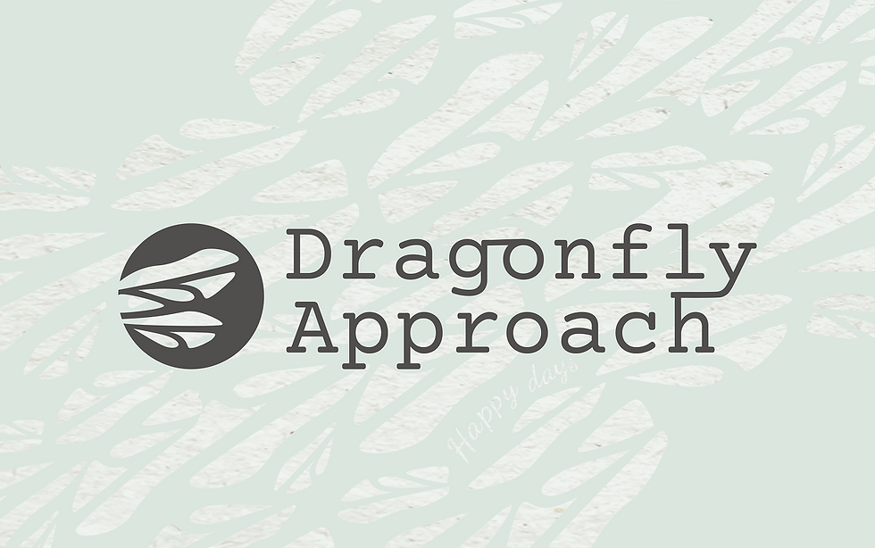
Dragonfly Approach's primary mark is built from the dragonfly's wing, translated into a circular stamp form. The forward-spreading wing shapes are deliberate and understated, relying on organic form rather than decoration to create a recognizable identity.
At a deeper level, the mark reflects the connection between growth and guidance that defines Daniele's work. The branching wing forms reference synaptic pathways, echoing the intersection of AI and human thinking, while the intentional wing asymmetry keeps the mark human first rather than mechanically perfect. The circular stamp form pairs with a customized typewriter wordmark, grounding the mark's organic movement in a precise, considered lockup. Together, these qualities embody Dragonfly Approach's belief that AI adoption works best when it stays practical, grounded, and human.

Patterns
Dragonfly Approach's pattern system extends the logomark's wing and leaf forms into a set of supporting textures. Built with the same organic, hand-drawn quality as the mark, the patterns bring movement and warmth to backgrounds, packaging, and other brand-heavy touchpoints.
Each pattern draws from the brand's core palette, pairing sage, chalk, and warm gold with charcoal for contrast. Repeating leaf and wing shapes reinforce the sense of growth and connection established in the logomark. These patterns are reserved for print and web applications where the brand can feel more expressive, and are not used in learning materials or client-facing deliverables.

Textures
Dragonfly Approach's textures draw from natural materials: plaster, handmade paper, raw wood grain, and woven canvas, each rendered in soft, neutral tones. Together they add a tactile, grounded quality to the identity, reinforcing a sense of something organic and considered rather than polished or synthetic.
These textures work alongside the pattern system to add depth and warmth to brand-heavy applications like print and web, without competing with the color palette or typography. Like the patterns, they are reserved for expressive brand touchpoints and are not used in learning materials or client-facing deliverables.

Brand in action
The brand identity was designed to perform consistently across a wide range of applications, from client-facing applications and slide content to notebooks and totes. Through a disciplined color palette, warm typography, and a flexible logo system, the brand maintains recognition whether it appears on a printed piece, a merchandise item, or a digital touchpoint. These applications demonstrate how the identity extends beyond a mark, creating a cohesive system that reinforces Dragonfly Approach's values of trust, practicality, and human connection.
